前言
现如今网页越来越趋近于动画,相信大家平时浏览网页或多或少都能看到一些动画效果,今天我们来做一个有意思的动画效果,通过 css3 实现元素融合效果,下面一起看看吧。
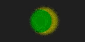
实现效果
完整源码
<template>
<div class="parentBox">
<div class="contantBox"></div>
</div>
</template>
<style lang="less" scoped>
.parentBox {
height: 100%;
background: rgb(31, 31, 31);
padding: 100px;
@keyframes filterBallMove {
50% {
left: 140px;
}
}
@keyframes filterBallMove2 {
50% {
right: 140px;
}
}
.contantBox {
position: absolute;
top: 50%;
left: 50%;
transform: translate(-50%, -50%);
width: 300px;
height: 200px;
filter: contrast(20);
}
.contantBox::before {
content: "";
position: absolute;
width: 120px;
height: 120px;
border-radius: 50%;
background: olive;
top: 40px;
left: 80px;
z-index: 2;
filter: blur(6px);
box-sizing: border-box;
animation: filterBallMove 4s ease-out infinite;
}
.contantBox::after {
content: "";
position: absolute;
width: 80px;
height: 80px;
border-radius: 50%;
background: green;
top: 60px;
right: 40px;
z-index: 2;
filter: blur(6px);
animation: filterBallMove2 4s ease-out infinite;
}
}
</style>
文字融合
实现效果

完整源码
<template>
<div class="parentBox">
<div class="contantBox">
<h1>hello Word!</h1>
</div>
</div>
</template>
<style lang="less" scoped>
.parentBox {
height: 100%;
background: rgb(31, 31, 31);
padding: 100px;
.contantBox {
width: 100%;
height: 100%;
position: relative;
padding: 4em;
filter: contrast(20);
overflow: hidden;
background: rgb(0, 0, 0);
h1 {
font-family: Righteous;
color: white;
font-size: 4rem;
text-transform: uppercase;
line-height: 1;
animation: letterspacing 3s infinite alternate ease-in-out;
display: block;
position: absolute;
left: 50%;
top: 50%;
transform: translate3d(-50%, -50%, 0);
letter-spacing: -2.2rem;
}
}
@keyframes letterspacing {
0% {
letter-spacing: -2.4rem;
filter: blur(0.3rem);
}
50% {
filter: blur(0.5rem);
}
100% {
letter-spacing: 0.5rem;
filter: blur(0rem);
color: #fff;
}
}
}
</style>
到此这篇关于基于CSS实现元素融合效果的文章就介绍到这了,更多相关css元素融合内容请搜索悠久资源网以前的文章或继续浏览下面的相关文章,希望大家以后多多支持悠久资源网!
