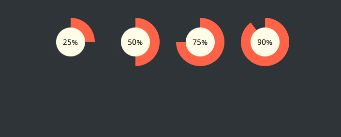
实现效果
实现代码
html
<div class="wrap">
<div class="progress-radial progress-25">
<div class="overlay">25%</div>
</div>
<div class="progress-radial progress-50">
<div class="overlay">50%</div>
</div>
<div class="progress-radial progress-75">
<div class="overlay">75%</div>
</div>
<div class="progress-radial progress-90">
<div class="overlay">90%</div>
</div>
</div>
css
@import url(https://fonts.googleapis.com/css?family=Noto+Sans);
body {
padding: 30px 0;
background-color: #2f3439;
font-family: "Noto Sans", sans-serif;
}
.wrap {
width: 600px;
margin: 0 auto;
}
/* ————————————-
* Bar container
* ————————————- */
.progress-radial {
float: left;
margin-right: 30px;
position: relative;
width: 100px;
height: 100px;
border-radius: 50%;
border: 2px solid #2f3439;
background-color: tomato;
}
/* ————————————-
* Optional centered circle w/text
* ————————————- */
.progress-radial .overlay {
position: absolute;
width: 60px;
height: 60px;
background-color: #fffde8;
border-radius: 50%;
margin-left: 20px;
margin-top: 20px;
text-align: center;
line-height: 60px;
font-size: 16px;
}
/* ————————————-
* Mixin for progress-% class
* ————————————- */
.progress-0 {
background-image: linear-gradient(90deg, #2f3439 50%, rgba(0, 0, 0, 0) 50%, rgba(0, 0, 0, 0)), linear-gradient(90deg, #ff6347 50%, #2f3439 50%, #2f3439);
}
.progress-5 {
background-image: linear-gradient(90deg, #2f3439 50%, rgba(0, 0, 0, 0) 50%, rgba(0, 0, 0, 0)), linear-gradient(108deg, #ff6347 50%, #2f3439 50%, #2f3439);
}
.progress-10 {
background-image: linear-gradient(90deg, #2f3439 50%, rgba(0, 0, 0, 0) 50%, rgba(0, 0, 0, 0)), linear-gradient(126deg, #ff6347 50%, #2f3439 50%, #2f3439);
}
.progress-15 {
background-image: linear-gradient(90deg, #2f3439 50%, rgba(0, 0, 0, 0) 50%, rgba(0, 0, 0, 0)), linear-gradient(144deg, #ff6347 50%, #2f3439 50%, #2f3439);
}
.progress-20 {
background-image: linear-gradient(90deg, #2f3439 50%, rgba(0, 0, 0, 0) 50%, rgba(0, 0, 0, 0)), linear-gradient(162deg, #ff6347 50%, #2f3439 50%, #2f3439);
}
.progress-25 {
background-image: linear-gradient(90deg, #2f3439 50%, rgba(0, 0, 0, 0) 50%, rgba(0, 0, 0, 0)), linear-gradient(180deg, #ff6347 50%, #2f3439 50%, #2f3439);
}
.progress-30 {
background-image: linear-gradient(90deg, #2f3439 50%, rgba(0, 0, 0, 0) 50%, rgba(0, 0, 0, 0)), linear-gradient(198deg, #ff6347 50%, #2f3439 50%, #2f3439);
}
.progress-35 {
background-image: linear-gradient(90deg, #2f3439 50%, rgba(0, 0, 0, 0) 50%, rgba(0, 0, 0, 0)), linear-gradient(216deg, #ff6347 50%, #2f3439 50%, #2f3439);
}
.progress-40 {
background-image: linear-gradient(90deg, #2f3439 50%, rgba(0, 0, 0, 0) 50%, rgba(0, 0, 0, 0)), linear-gradient(234deg, #ff6347 50%, #2f3439 50%, #2f3439);
}
.progress-45 {
background-image: linear-gradient(90deg, #2f3439 50%, rgba(0, 0, 0, 0) 50%, rgba(0, 0, 0, 0)), linear-gradient(252deg, #ff6347 50%, #2f3439 50%, #2f3439);
}
.progress-50 {
background-image: linear-gradient(-90deg, #ff6347 50%, rgba(0, 0, 0, 0) 50%, rgba(0, 0, 0, 0)), linear-gradient(270deg, #ff6347 50%, #2f3439 50%, #2f3439);
}
.progress-55 {
background-image: linear-gradient(-72deg, #ff6347 50%, rgba(0, 0, 0, 0) 50%, rgba(0, 0, 0, 0)), linear-gradient(270deg, #ff6347 50%, #2f3439 50%, #2f3439);
}
.progress-60 {
background-image: linear-gradient(-54deg, #ff6347 50%, rgba(0, 0, 0, 0) 50%, rgba(0, 0, 0, 0)), linear-gradient(270deg, #ff6347 50%, #2f3439 50%, #2f3439);
}
.progress-65 {
background-image: linear-gradient(-36deg, #ff6347 50%, rgba(0, 0, 0, 0) 50%, rgba(0, 0, 0, 0)), linear-gradient(270deg, #ff6347 50%, #2f3439 50%, #2f3439);
}
.progress-70 {
background-image: linear-gradient(-18deg, #ff6347 50%, rgba(0, 0, 0, 0) 50%, rgba(0, 0, 0, 0)), linear-gradient(270deg, #ff6347 50%, #2f3439 50%, #2f3439);
}
.progress-75 {
background-image: linear-gradient(0deg, #ff6347 50%, rgba(0, 0, 0, 0) 50%, rgba(0, 0, 0, 0)), linear-gradient(270deg, #ff6347 50%, #2f3439 50%, #2f3439);
}
.progress-80 {
background-image: linear-gradient(18deg, #ff6347 50%, rgba(0, 0, 0, 0) 50%, rgba(0, 0, 0, 0)), linear-gradient(270deg, #ff6347 50%, #2f3439 50%, #2f3439);
}
.progress-85 {
background-image: linear-gradient(36deg, #ff6347 50%, rgba(0, 0, 0, 0) 50%, rgba(0, 0, 0, 0)), linear-gradient(270deg, #ff6347 50%, #2f3439 50%, #2f3439);
}
.progress-90 {
background-image: linear-gradient(54deg, #ff6347 50%, rgba(0, 0, 0, 0) 50%, rgba(0, 0, 0, 0)), linear-gradient(270deg, #ff6347 50%, #2f3439 50%, #2f3439);
}
.progress-95 {
background-image: linear-gradient(72deg, #ff6347 50%, rgba(0, 0, 0, 0) 50%, rgba(0, 0, 0, 0)), linear-gradient(270deg, #ff6347 50%, #2f3439 50%, #2f3439);
}
.progress-100 {
background-image: linear-gradient(90deg, #ff6347 50%, rgba(0, 0, 0, 0) 50%, rgba(0, 0, 0, 0)), linear-gradient(270deg, #ff6347 50%, #2f3439 50%, #2f3439);
}
以上就是CSS实现的圆形进度栏的详细内容,更多关于CSS实现圆形进度栏的资料请关注悠久资源网其它相关文章!
