本文主要介绍了CSS3中Animation实现简单的手指点击动画的示例,分享给大家,具体如下:
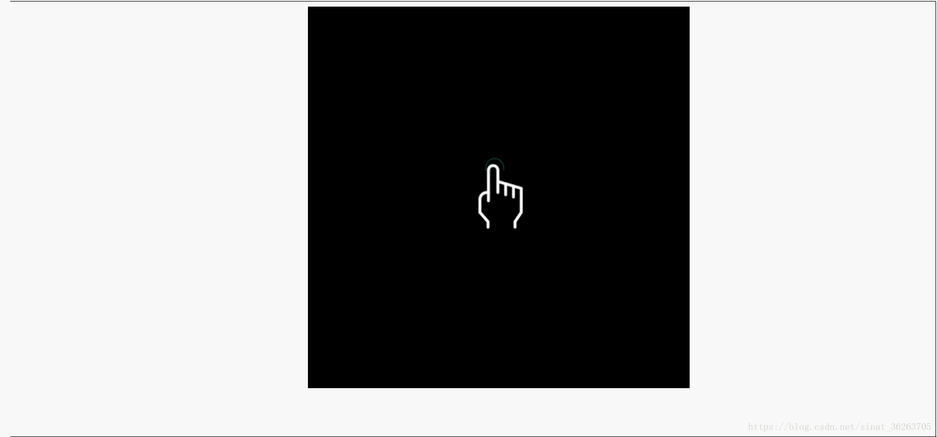
效果图
<!DOCTYPE html>
<html>
<head>
<meta charset="UTF-8">
<meta name="viewport" content="width=device-width, initial-scale=1.0, maximum-scale=1.0, user-scalable=0" />
<title>CSS3–通过Animation实现简单的手指点击动画</title>
<style>
.wrapper{position:relative;overflow:hidden;width:500px;height:500px;margin:0 auto;background-color:black}
.circle{position:absolute;left:50%;top:50%;margin:-70px 0 0 -46px;
background: url("./circle.png") center center no-repeat;
width:62px;height:62px;animation:circleHide 1s ease infinite both}
.finger{background:url("./finger.png") center center no-repeat;width:100px;height:140px;margin:170px auto;animation:fingerHandle 1s ease infinite both}
@keyframes fingerHandle{
0%{transform:none}
70%{transform:scale3d(.8,.8,.8)}
100%{transform:none}
}
@keyframes circleHide{
0%{opacity:0;transform:scale3d(0,0,0)}
70%{opacity:1;transform:scale3d(1.2,1.2,1.2)}
100%{opacity:0;transform:scale3d(0,0,0)}
}
</style>
</head>
<body>
<div class="wrapper">
<div class="circle"></div>
<div class="finger"></div>
</div>
</body>
</html>
到此这篇关于CSS3中Animation实现简单的手指点击动画的示例的文章就介绍到这了,更多相关CSS3手指点击动画内容请搜索悠久资源网以前的文章或继续浏览下面的相关文章,希望大家以后多多支持悠久资源网!
