目录
- 前言
- 1. 小鸡按钮
- 2. 横线按钮
- 3. 凹凸按钮
- 4. 波纹按钮
- 5. 光影按钮
前言
按钮在开发中使用的频率非常的高,ui 框架中的按钮组件也都是层出不穷,今天教大家仅用 css 实现一些非常炫酷的按钮效果,下面一起来看看吧。
1. 小鸡按钮
实现效果
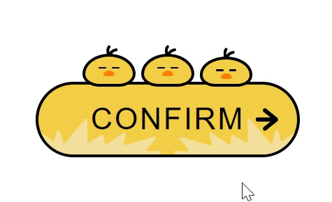
完整源码
<template>
<div class="parentBox">
<!– 按钮 –>
<div class="contantBox btnBridBox">
<div class="outerBox">
<span class="textBox">CONFIRM</span>
</div>
<!– 三只小鸡 –>
<div class="birdBox">
<div class="chookBox chookUseBox">
<div class="faceBox"></div>
</div>
<div class="chookBox chookUseBox">
<div class="faceBox"></div>
</div>
<div class="chookBox">
<div class="faceBox"></div>
</div>
</div>
</div>
</div>
</template>
<style lang="less" scoped>
.parentBox {
height: 100%;
padding: 200px;
.contantBox {
display: flex;
justify-content: center;
align-items: center;
box-sizing: border-box;
width: 280px;
height: 80px;
text-decoration: none;
border: solid 3px #000;
border-radius: 40px;
background: var(–main_color);
position: relative;
}
.btnBridBox {
–main_color: #f4cf47;
–sub_color1: #f4e19c;
–sub_color2: #ff8108;
–base_color: #000;
–border_radius1: 60px 60px 40px 40px / 48px 48px 30px 30px;
–border_radius2: 70px 70px 40px 40px / 48px 48px 30px 30px;
–border_radius3: 40px 40px 40px 40px / 48px 48px 30px 30px;
}
.outerBox {
display: flex;
justify-content: center;
align-items: center;
width: 100%;
height: 100%;
border-radius: 40px;
overflow: hidden;
position: relative;
.textBox {
position: relative;
font-size: 32px;
letter-spacing: 2px;
color: var(–base_color);
transition: all 0.3s ease;
}
}
.contantBox::before {
content: "";
position: absolute;
right: 20px;
margin: auto 0;
width: 24px;
height: 24px;
background: var(–base_color);
clip-path: path(
"M24,12.02c0-1.09-.75-1.71-.81-1.77L11.17,.45c-.91-.74-2.21-.56-2.91,.42-.69,.97-.52,2.37,.39,3.11l7.12,5.81-13.7-.02h0C.93,9.77,0,10.76,0,11.99c0,1.23,.93,2.22,2.07,2.22l13.7,.02-7.13,5.78c-.91,.74-1.09,2.13-.4,3.11,.41,.58,1.03,.88,1.65,.88,.44,0,.88-.15,1.25-.45l12.04-9.76c.07-.06,.82-.67,.82-1.77Z"
);
transition: all ease 0.2s;
}
.btnBridBox .outerBox::before,
.btnBridBox .outerBox::after {
content: "";
position: absolute;
bottom: 0;
width: 130px;
height: 38px;
background: var(–sub_color1);
transition: all 0.5s ease;
clip-path: path(
"M13.77,37.35L.25,16.6c-.87-1.33,.69-2.91,2-2.02l12.67,8.59c.81,.55,1.91,.14,2.18-.81l2.62-9.33c.39-1.4,2.34-1.42,2.76-.02l3.6,11.99c.33,1.11,1.74,1.4,2.47,.52L49.38,.52c.87-1.04,2.53-.42,2.53,.95V23.7c0,1.13,1.2,1.83,2.16,1.26l12.75-7.51c.85-.5,1.94,0,2.13,.98l1.5,7.6c.2,1.03,1.37,1.51,2.22,.92l17.74-12.3c1.09-.75,2.52,.25,2.21,1.55l-2.44,10.2c-.26,1.09,.74,2.06,1.8,1.75l30.8-9.04c1.37-.4,2.42,1.26,1.49,2.36l-9.07,10.66c-.83,.98-.1,2.49,1.17,2.42l12.12-.68c1.6-.09,2.12,2.15,.65,2.8l-2.73,1.21c-.18,.08-.38,.12-.58,.12H14.97c-.48,0-.93-.25-1.2-.65Z"
);
}
.btnBridBox .outerBox::before {
left: 0;
}
.btnBridBox .outerBox::after {
right: 0;
transform: rotateY(180deg);
}
.contantBox :hover {
cursor: pointer;
}
.contantBox:hover .outerBox::before {
transform: translateX(-12px);
}
.contantBox:hover .outerBox::after {
transform: rotateY(180deg) translateX(-12px);
}
.contantBox:hover .textBox {
letter-spacing: 4px;
}
.contantBox:hover::before {
right: 14px;
}
.birdBox {
position: absolute;
top: -54px;
display: flex;
justify-content: space-between;
align-items: flex-end;
width: 180px;
height: 56px;
.chookBox {
position: relative;
width: 56px;
height: 36px;
box-sizing: border-box;
border: solid 3px #000;
background: var(–main_color);
border-radius: var(–border_radius1);
animation: sleep 1s ease infinite alternate;
display: flex;
justify-content: center;
.faceBox {
position: absolute;
top: 15px;
width: 12px;
height: 6px;
background: var(–sub_color2);
border-radius: 50% 50% 50% 50% / 78% 78% 22% 22%;
transition: 0.2s;
}
.faceBox::before,
.faceBox::after {
content: "";
position: absolute;
top: -4px;
width: 8px;
height: 2px;
border-radius: 4px;
background: #000;
}
.faceBox::before {
left: -5px;
}
.faceBox::after {
right: -5px;
}
}
.chookBox::before {
content: "";
position: absolute;
top: -12px;
left: 22px;
width: 12px;
height: 12px;
background: #000;
clip-path: path(
"M10.23,3.32c-3.54,.63-5.72,2.51-7.02,4.23-.33-1.58-.34-3.54,.93-5.12,.52-.65,.41-1.59-.24-2.11C3.24-.19,2.29-.08,1.77,.57c-3.82,4.77-.31,11.11-.13,11.42,0,0,0,0,0,0,0,0,0,0,0,0,0,0,0,0,0,0-.01-.02,2.49,.04,2.52,0,.1-.14,1.54-4.82,6.59-5.71,.82-.14,1.37-.92,1.22-1.74s-.94-1.36-1.75-1.21Z"
);
}
}
.contantBox:hover .chookUseBox {
animation: chookUseBox 0.2s ease;
animation-fill-mode: forwards;
}
.contantBox:hover .chookUseBox .faceBox {
top: 20px;
}
.contantBox:hover .chookUseBox .faceBox::before,
.contantBox:hover .chookUseBox .faceBox::after {
animation: eye 5s linear infinite;
}
.contantBox:hover .chookUseBox:nth-child(2) .faceBox::before,
.contantBox:hover .chookUseBox:nth-child(2) .faceBox::after {
animation: eye_2 5s linear infinite;
}
@keyframes chookUseBox {
0% {
height: 32px;
border-radius: var(–border_radius2);
}
100% {
height: 56px;
border-radius: var(–border_radius3);
}
}
@keyframes eye {
0% {
top: -6px;
width: 6px;
height: 6px;
}
30% {
top: -6px;
width: 6px;
height: 6px;
}
32% {
top: -4px;
width: 8px;
height: 2px;
}
34% {
top: -6px;
width: 6px;
height: 6px;
}
70% {
top: -6px;
width: 6px;
height: 6px;
}
72% {
top: -4px;
width: 8px;
height: 2px;
}
74% {
top: -6px;
width: 6px;
height: 6px;
}
76% {
top: -4px;
width: 8px;
height: 2px;
}
78% {
top: -6px;
width: 6px;
height: 6px;
}
100% {
top: -6px;
width: 6px;
height: 6px;
}
}
@keyframes eye_2 {
0% {
top: -6px;
width: 6px;
height: 6px;
}
10% {
transform: translateX(0);
}
12% {
transform: translateX(3px);
}
20% {
top: -6px;
width: 6px;
height: 6px;
}
22% {
top: -4px;
width: 8px;
height: 2px;
}
24% {
top: -6px;
width: 6px;
height: 6px;
}
25% {
transform: translateX(3px);
}
27% {
transform: translateX(0);
}
74% {
top: -6px;
width: 6px;
height: 6px;
transform: translateX(0);
}
76% {
top: -4px;
width: 8px;
height: 2px;
transform: translateX(3px);
}
78% {
top: -6px;
width: 6px;
height: 6px;
}
80% {
top: -4px;
width: 8px;
height: 2px;
}
82% {
top: -6px;
width: 6px;
height: 6px;
}
85% {
transform: translateX(3px);
}
87% {
transform: translateX(0);
}
100% {
top: -6px;
width: 6px;
height: 6px;
transform: translateX(0);
}
}
@keyframes sleep {
0% {
height: 36px;
border-radius: var(–border_radius1);
}
100% {
height: 32px;
border-radius: var(–border_radius2);
}
}
}
</style>
2. 横线按钮
实现效果

完整源码
<template>
<div class="parentBox">
<div class="btnBox">Hello</div>
</div>
</template>
<style scoped>
.parentBox {
padding: 100px;
height: 100%;
background: black;
}
.btnBox {
text-align: center;
color: #fff;
cursor: pointer;
display: block;
line-height: 45px;
width: 160px;
letter-spacing: 2px;
font-size: 16px;
}
.btnBox:after,
.btnBox:before {
-webkit-backface-visibility: hidden;
backface-visibility: hidden;
border: 1px solid rgba(255, 255, 255, 0);
bottom: 0px;
content: " ";
display: block;
margin: 0 auto;
position: relative;
-webkit-transition: all 280ms ease-in-out;
transition: all 280ms ease-in-out;
width: 0;
}
.btnBox:hover:after,
.btnBox:hover:before {
-webkit-backface-visibility: hidden;
backface-visibility: hidden;
border-color: #fff;
-webkit-transition: width 350ms ease-in-out;
transition: width 350ms ease-in-out;
width: 70%;
}
.btnBox:hover:before {
bottom: auto;
top: 0;
width: 70%;
}
</style>
3. 凹凸按钮
实现效果

完整源码
<template>
<div class="parentBox">
<div class="btnBox">Hello</div>
</div>
</template>
<style scoped>
.parentBox {
padding: 100px;
height: 100%;
background: black;
}
.btnBox {
text-align: center;
color: #fff;
cursor: pointer;
display: block;
line-height: 45px;
width: 160px;
letter-spacing: 2px;
font-size: 16px;
}
.btnBox {
background: #e3403a;
border: 1px solid #da251f;
box-shadow: 0px 2px 0 #d6251f, 2px 4px 6px #e02a24;
font-weight: 900;
letter-spacing: 1px;
-webkit-transition: all 150ms linear;
transition: all 150ms linear;
}
.btnBox:hover {
background: #e02c26;
border: 1px solid rgba(0, 0, 0, 0.05);
box-shadow: 1px 1px 2px rgba(255, 255, 255, 0.2);
color: #ec817d;
text-decoration: none;
text-shadow: -1px -1px 0 #c2211c;
-webkit-transition: all 250ms linear;
transition: all 250ms linear;
}
</style>
4. 波纹按钮
实现效果

完整源码
<template>
<div class="parentBox">
<div class="btnBox"><span>Hello</span></div>
</div>
</template>
<style scoped>
.parentBox {
padding: 100px;
height: 100%;
background: black;
}
.btnBox {
text-align: center;
color: #fff;
cursor: pointer;
display: block;
line-height: 45px;
width: 160px;
letter-spacing: 2px;
font-size: 16px;
}
.btnBox {
border: 0 solid;
box-shadow: inset 0 0 20px rgba(255, 255, 255, 0);
outline: 1px solid;
outline-color: rgba(255, 255, 255, 0.5);
outline-offset: 0px;
text-shadow: none;
-webkit-transition: all 1250ms cubic-bezier(0.19, 1, 0.22, 1);
transition: all 1250ms cubic-bezier(0.19, 1, 0.22, 1);
}
.btnBox:hover {
border: 1px solid;
box-shadow: inset 0 0 20px rgba(255, 255, 255, 0.5),
0 0 20px rgba(255, 255, 255, 0.2);
outline-color: rgba(255, 255, 255, 0);
outline-offset: 15px;
text-shadow: 1px 1px 2px #427388;
}
</style>
5. 光影按钮
实现效果

完整源码
<template>
<div class="parentBox">
<div class="btnBox"><span>Hello</span></div>
</div>
</template>
<style scoped>
.parentBox {
padding: 100px;
height: 100%;
background: black;
}
.btnBox {
text-align: center;
color: #fff;
cursor: pointer;
display: block;
line-height: 45px;
width: 160px;
letter-spacing: 2px;
font-size: 16px;
}
.btnBox {
border: 1px solid;
overflow: hidden;
position: relative;
z-index: 200;
}
.btnBox span {
z-index: 200;
}
.btnBox:after {
background: #fff;
content: "";
height: 155px;
left: -75px;
opacity: 0.2;
position: absolute;
top: -50px;
-webkit-transform: rotate(35deg);
-ms-transform: rotate(35deg);
transform: rotate(35deg);
-webkit-transition: all 550ms cubic-bezier(0.19, 1, 0.22, 1);
transition: all 550ms cubic-bezier(0.19, 1, 0.22, 1);
width: 50px;
z-index: -10;
}
.btnBox:hover:after {
left: 120%;
-webkit-transition: all 550ms cubic-bezier(0.19, 1, 0.22, 1);
transition: all 550ms cubic-bezier(0.19, 1, 0.22, 1);
}
</style>
到此这篇关于基于css实现炫酷按钮动画效果案例代码的文章就介绍到这了,更多相关css按钮动画内容请搜索悠久资源网以前的文章或继续浏览下面的相关文章,希望大家以后多多支持悠久资源网!
