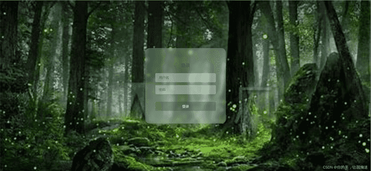
本文主要介绍了html5登录玻璃界面特效,废话不多说,具体如下:
<!DOCTYPE html>
<html lang=\”en\”>
<head>
<meta charset=\”UTF-8\”>
<meta name=\”viewport\” content=\”width=device-width, initial-scale=1.0\”>
<meta http-equiv=\”X-UA-Compatible\” content=\”ie=edge\”></meta>
<title>Document</title>
<style>
html,
body {
margin: 0;
padding: 0;
font-family: \”PingFang SC\”, \”Microsoft Yahei\”, sans-serif;
}
.container {
width: 100vw;
height: 100vh;
display: flex;
align-items: center;
justify-content: center;
background: url(\”https://tse3-mm.cn.bing.net/th/id/OIP-C.8lHGYyoBPuSLsS6yFB5ACwHaEK?w=321&h=180&c=7&r=0&o=5&dpr=1.3&pid=1.7\”) fixed no-repeat;
background-size: cover;
}
.login-form {
width: 240px;
height: 220px;
display: flex;
flex-direction: column;
padding: 40px;
text-align: center;
position: relative;
z-index: 100;
background: inherit;
border-radius: 18px;
overflow: hidden;
}
.login-form::before {
content: \”\”;
width: calc(100% + 20px);
height: calc(100% + 20px);
background: inherit;
box-shadow: inset 0 0 0 200px rgba(255, 255, 255, 0.25);
position: absolute;
top: -10px;
left: -10px;
z-index: -1;
filter: blur(6px);
overflow: hidden;
}
.login-form h2 {
font-size: 18px;
font-weight: 400;
color: #3d5245;
}
.login-form input,
.login-form button {
margin: 6px 0;
height: 36px;
border: none;
background-color: rgba(255, 255, 255, 0.3);
border-radius: 4px;
padding: 0 14px;
color: #3d5245;
}
.login-form input::placeholder {
color: #3d5245;
}
.login-form button {
margin-top: 24px;
background-color: rgba(57, 88, 69, 0.4);
color: white;
position: relative;
overflow: hidden;
cursor: pointer;
transition: 0.4s;
}
.login-form button:hover {
background-color: rgba(12, 80, 38, 0.67);
}
.login-form button::before,
.login-form button::after {
content: \”\”;
display: block;
width: 80px;
height: 100%;
background: rgba(179, 255, 210, 0.5);
opacity: 0.5;
position: absolute;
left: 0;
top: 0;
transform: skewX(-15deg);
filter: blur(30px);
overflow: hidden;
transform: translateX(-100px);
}
.login-form button::after {
width: 40px;
background: rgba(179, 255, 210, 0.3);
left: 60px;
filter: blur(5px);
opacity: 0;
}
.login-form button:hover::before {
transition: 1s;
transform: translateX(320px);
opacity: 0.7;
}
.login-form button:hover::after {
transition: 1s;
transform: translateX(320px);
opacity: 1;
}
</style>
</head>
<body>
<div>
<div class=\”container\”>
<form action=\”#\” class=\”login-form\”>
<h2>登录</h2>
<input type=\”text\” name=\”username\” placeholder=\”用户名\”>
<input type=\”password\” name=\”password\” placeholder=\”密码\”>
<button type=\”submit\”>登录</button>
</form>
</div>
</div>
</body>
</html>
到此这篇关于html5登录玻璃界面特效的文章就介绍到这了,更多相关html5登录玻璃内容请搜索悠久资源网以前的文章或继续浏览下面的相关文章,希望大家以后多多支持悠久资源网!
