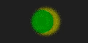
整体效果
使用-webkit-background-clip和 clip-path,并配合animation属性,实现一个好看聚光灯效果。
可适用于页面加载或展示页面大标题内容。
核心代码部分,简要说明了写法思路;完整代码在最后,可直接复制到本地运行。
核心代码
html 代码
<div class=\”spotlight18\” data-cont=\”spotlight\”>spotlight</div>
主体部分一个div标签。
css 部分代码
.spotlight18{
color: #eaeaea;
font-size: 40px;
font-weight: 900;
text-transform: uppercase;
position: relative;
}
.spotlight18:before{
width: inherit;
height: inherit;
content: attr(data-cont);
clip-path: ellipse(32px 32px at 0 50%);
color: transparent;
background-image: linear-gradient(90deg, #4158D0 0%, #C850C0 30%, #FFCC70 66%, #56e28d 100%);
-webkit-background-clip: text;
position: absolute;
top: 0;
left: 0;
animation: spotlight18 8s linear infinite;
}
@keyframes spotlight18{
0%{
clip-path: ellipse(32px 32px at 0 50%);
}
50%{
clip-path: ellipse(32px 32px at 100% 50%);
}
100%{
clip-path: ellipse(32px 32px at 0 50%);
}
}
用background-image的 linear-gradient拉出渐变背景,让文字颜色透明color: transparent,然后配合 -webkit-background-clip: text给文字实现渐变效果,最后加上动画属性animation并设置clip-path参数就可以啦。
注意:这里使用的是-webkit-background-clip,而不是background-clip。
完整代码如下
html 页面
<!DOCTYPE html>
<html lang=\”zh\”>
<head>
<meta charset=\”utf-8\”>
<link rel=\”stylesheet\” href=\”style.css\”>
<title>聚光灯效果</title>
</head>
<body>
<div class=\”app\”>
<div class=\”spotlight18\” data-cont=\”spotlight\”>spotlight</div>
</div>
</body>
</html>
css 样式
/** style.css **/
.app{
width: 100%;
height: 100vh;
background-color: #ffffff;
position: relative;
display: flex;
justify-content: center;
align-items: center;
}
.spotlight18{
color: #eaeaea;
font-size: 40px;
font-weight: 900;
text-transform: uppercase;
position: relative;
}
.spotlight18:before{
width: inherit;
height: inherit;
content: attr(data-cont);
color: transparent;
background-image: linear-gradient(90deg, #4158D0 0%, #C850C0 30%, #FFCC70 66%, #56e28d 100%);
-webkit-background-clip: text;
position: absolute;
top: 0;
left: 0;
animation: spotlight18 8s linear infinite;
}
@keyframes spotlight18{
0%{
clip-path: ellipse(32px 32px at 0 50%);
}
50%{
clip-path: ellipse(32px 32px at 100% 50%);
}
100%{
clip-path: ellipse(32px 32px at 0 50%);
}
}
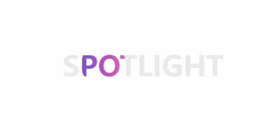
页面渲染效果

到此这篇关于CSS实现好看的聚光灯效果的文章就介绍到这了,更多相关CSS聚光灯内容请搜索悠久资源网以前的文章或继续浏览下面的相关文章,希望大家以后多多支持悠久资源网!
