
我要找工作 !!!
预先准备:
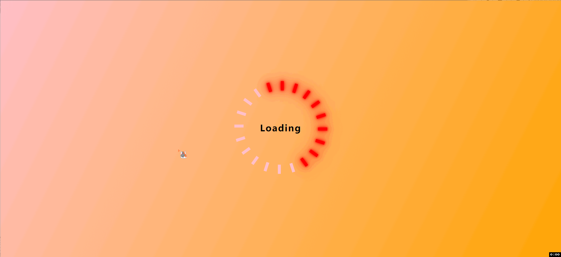
首先这个动画,是根据之前的 Loading 动画制作的,Loading炫酷动画, 这些的思路都是一样的,在这个动画上进行了一次创新。
预习知识点:
- 动画帧
- 背景渐变
- var() 和 calc() 的使用
- flex布局的场景
- 多个动画操作
- 延迟动画的使用
开始
核心代码分析
transform: rotate(calc(30deg * var(–i)));
transform-origin: 0 250px;
animation: rotate 5s linear infinite;
animation-delay: calc(0.42s * var(–i));
根据在 HTML 上搭建的style 样式, 获取每个对应的i值, 分别计算每个时刻盒子的旋转度数, 同时我们更改他们的初始旋转点, 不然每个都只是中心旋转, 转成了一个圆形。
思路还是loading的制作思路, 只不过这次尺寸比例放大了,

HTML代码搭建:
<div class="box">
<div class="color" style="–i:1">1</div>
<div class="color" style="–i:2">2</div>
<div class="color" style="–i:3">3</div>
<div class="color" style="–i:4">4</div>
<div class="color" style="–i:5">5</div>
<div class="color" style="–i:6">6</div>
<div class="color" style="–i:7">7</div>
<div class="color" style="–i:8">8</div>
<div class="color" style="–i:9">9</div>
<div class="color" style="–i:10">10</div>
<div class="color" style="–i:11">11</div>
<div class="color" style="–i:12">12</div>
<div class="hours"></div>
<div class="mintues"></div>
</div>
Less代码:
* {
margin: 0px;
padding: 0px;
box-sizing: border-box;
}
body {
background: -webkit-linear-gradient(left top, pink, rgb(90, 83, 83));
display: flex;
min-height: 100vh;
justify-content: center;
align-items: center;
section {
height: 500px;
width: 500px;
.box {
position: relative;
height: 500px;
width: 500px;
display: flex;
justify-content: center;
align-items: center;
border: 5px solid #e2adb6;
border-radius: 50%;
// border: 2px solid red;
&:hover .color {
animation-play-state: paused;
}
&::after {
content: "";
display: block;
height: 25px;
width: 25px;
background-color: #000;
z-index: 4;
border-radius: 50%;
}
@keyframes rotate {
0%,
50% {
text-shadow: none;
color: #000;
transform: rotate(calc(30deg * var(–i))) scale(1);
}
50.1%,
100% {
text-shadow: 0 0 10px #000,
0 0 15px #000;
color: #fff;
transform: rotate(calc(30deg * var(–i))) scale(1.01);
}
}
.color {
position: absolute;
top: 0;
color: #f2f2f2;
opacity: .6;
font-size: 20px;
transform: rotate(calc(30deg * var(–i)));
transform-origin: 0 250px;
line-height: 50px;
animation: rotate 5s linear infinite;
animation-delay: calc(0.42s * var(–i));
}
@keyframes change1 {
0% {
transform: translateY(-50%) rotate(0deg);
transform-origin: 0 100px;
}
100% {
transform: translateY(-50%) rotate(360deg);
transform-origin: 0 100px;
}
}
@keyframes change2 {
0% {
transform: translateY(-50%) rotate(-30deg) rotate(0deg);
transform-origin: 0 150px;
}
100% {
transform: translateY(-50%) rotate(-30deg) rotate(360deg);
transform-origin: 0 150px;
}
}
.hours {
position: absolute;
top: 40%;
width: 5px;
transform: translateY(-50%);
height: 100px;
background-color: #f2f2f2;
animation: change1 24s linear infinite;
&::after {
content: "";
position: absolute;
top: 0;
left: -10px;
width: 20px;
height: 20px;
border-bottom: 5px solid #f2f2f2;
border-right: 5px solid #f2f2f2;
transform: rotate(-135deg);
}
}
.mintues {
position: absolute;
top: 36%;
width: 3px;
height: 150px;
background-color: #000;
transform: translateY(-50%) rotate(-30deg);
transform-origin: 0 150px;
animation: change2 2s linear infinite;
&::after {
content: "";
position: absolute;
top: 0;
left: -10px;
// display: block;
width: 20px;
height: 20px;
border-bottom: 3px solid #000;
border-right: 3px solid #000;
transform: rotate(-135deg);
}
}
}
}
}
到此这篇关于CSS实现漂亮的时钟动画效果的实例代码的文章就介绍到这了,更多相关css时钟动画内容请搜索悠久资源网以前的文章或继续浏览下面的相关文章,希望大家以后多多支持悠久资源网!
